

The Brief
Brand Background
We are a company that produces cutting edge software in the form of an app, ‘Macro Lab’.
We are a company that produces cutting edge software in the form of an app, ‘Macro Lab’.
The app allows technical engineers to run simulations after having put in details or data. The app can be used by a wide range of technical engineers, from those based within architecture, construction, meteorology, biology, chemical engineering, the financial sector, and so on.
Macro is at the forefront in the industry, and it’s a very cutting-edge company in a fast paced sector.
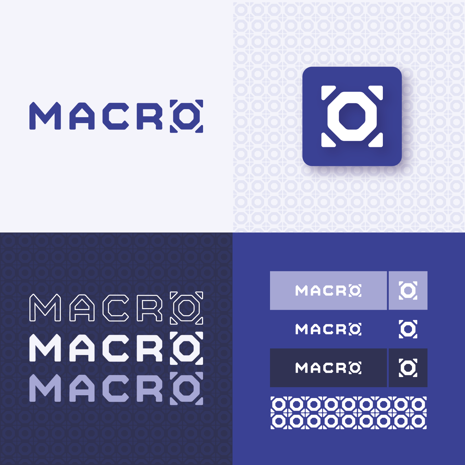
The brand name is ‘Macro’ and so the logo design should only contain that one word and that words alone.
A logomarks is also acceptable, but it must have the logotype ‘macro’ included.
Target Audience
Due to the nature of the app and the people who use it, the target audience is quite narrow.
Due to the nature of the app and the people who use it, the target audience is quite narrow.
The people who mainly interact with the brand are technical engineering students, professionals already in that sector, and importantly other brand entities in the industry that wish to collaborate with us.
It should also be noted that we do interact with brands outside of our industry, for the purposes of sponsorship and investments into our product.
The vast majority of the people who use our app are male, age 20-36.

My Response
I adapted the 'o' into a mark symbolising expansion and growth, taking from the literal definition of the word Macro and the corporate technical industries the app represents. I opted for a bold mono weight typeface, and a monochromatic colour palette that is modern and strong to denote functional stability, accuracy, and above all simplicity.
I adapted the 'o' into a mark symbolising expansion and growth, taking from the literal definition of the word Macro and the corporate technical industries the app represents. I opted for a bold mono weight typeface, and a monochromatic colour palette that is modern and strong to denote functional stability, accuracy, and above all simplicity.